Showing posts with label Color. Show all posts

Thursday, October 4, 2012

Inspired into Action!


Yes, I know, its thursday and I wasn't going to post until friday and then, only a brief one... BUT I happened upon this book. It is one of the most inspiring books to me that I have seen in a very long time! I was perusing at B& N last evening and after putting away the books I was looking at.. this one just said, check me out. I walked past it and there were others in another location. Again, it said, you have to at least look at this!

A New book of INSPIRATION!
 So, upon opening the cover, I knew I was in for a treat!

If you can't judge a book by its cover, you can often tell a lot by its signature page!

 Here is a sampling of what I found between signature pages.... lovely, yummy, colorful pictures!

I had to capture the photo of the toilet... no just kidding! I love LOVE LOVE the wall painting!

Here, the warm golds and cool turquoise are so dreamy together
 I was delighted to find photos of her studio! I love studio photos. I find it intriguing and inspiring to see the spaces that people create in. Of course, these are staged for photos, but to see the colors, textures and available lighting people work in, as well as how the space is laid out.. very inspiring. It makes me want to go downstairs to the studio and get everything UNPACKED! (which is what my plan for the day has changed to) My morning appointment has been postponed until next week.


Studio photo # 1 featured in the book- same 'roll carts' as mine, only mine are black and have nice scratches on the top from moving! 

Studio photo#2 My dream studio!
I love that her studio has beautiful LARGE open shelves for the yards of fabric.. Very neatly folded and displayed... like a nicely organized toolbox. The other thing is a bed.. for designing bedding ensembles! Brilliant! And it could most likely serve as a guest bedroom space... hmmmm..
A dress form for apron design and a sofa for relaxing and inspiration, as well as photos!

After looking through this book last evening I am inspired to paint, to draw, to sew and to dive into my stash. I am soo glad that I have opted to keep the entire stash here and not send out to storage those things that I think I will not be sewing.. some of those pieces, I finally have an idea what to do with them!

I hope you have enjoyed the surprise post today, look through the book, you won't be disappointed! It is bursting with colorful photos and features 20 projects and an original stencil. The Painted Home by Dena I just want to add, the photography is gorgeous in this book! The photographer John Ellis has done a fabulous job of capturing the beauty of these rooms!

I plan to dive into some fun stuff today, so maybe a sneak peak tomorrow as to what I have been up to and then MORE DRAPERY MATH on monday!


Monday, September 24, 2012

Feng shui and the Little Cottage by the River

I have started three posts that were just not inspiring to me, a recap of the weekend and what I have to do this week.. and I thought, this isn't what I want to share today. I want to share something of substance. So, I am taking a small part of the weekend and expanding upon it, sharing it with all of you.

Saturday was the meeting with the creative ladies group. It was a fabulous day, we finished up with putting together vintage patterns, vintage buttons and lovely pieces of wool for P. to sew into coats for the fall. There are some lovely pieces that we put together and all are excited for the finished results! She is going to start a blog of her own, I will be sure to provide a link...

Another friend, E. is working on a book (several to be more precise) regarding pattern shape, form, fit and their relationships. E. has an impressive history of accomplishment in this area as well as a very unique approach (she holds two patents directly related!) It is very important work! She has a very interesting story and her current situation is relevant and valuable to her relationship to the work that she is so passionate about.

Me, I shared a discovery that I had this week about my little cottage by the river.
Early in my career, I studied a bit of Feng Shui. I read a few books, invested in a weekend workshop with Carole Hyder and looked at how the principles would work with how I practice Interior Design.

After all that, I determined that most of it was just good design sense and I already was doing it subconsciously. So, I did not invest in further certification, etc. I use it more as a way of checking my work along with other systems that I am familiar with.

I realized just this week, how this house reflects the new lifestyle that is emerging and is being created. I see how my environment supports what I want. The biggest revelation has been the importance of the subconscious and how it will become more and more conscious for me and how I can work with it in achieving dreams and desires that I may not even be aware of right now. They are emerging..

This revelation came from the fact that my creative tools, materials, supplies... all of it is in the basement. I had to prepare this basement and lighten it up, get rid of the cobwebs and look at what I have. It isn't about getting rid of it all, it is about putting it all out there and seeing how it relates to each other. Then set it up in the most efficient and effective matrix as possible in this space. In dream interpretation, the basement is symbolic of the subconscious, as is any descent into the 'underground' or going into the earth.

The next thing I realized, is this little cottage/house is a perfect rectangle. Every area of the bagua is represented in its entirety. The house I used to live in, was missing wealth and helping people. The other thing I just realized is there were doors that I could not use because they didn't have keys to them. It was like I didn't have access to my own things (life) from different angles. Here, there is no key to the front door, however, I have my front door open often, as I love the light that it lets in and the color is perfect.

The color of my perfect front door is a midnight navy black. It is high gloss, so it has a reflective quality to it. The cool thing about that is.... are you ready for this? The color associated with the bagua of career (which is where my front door is-very ideal- career opportunities will find me! Hooray!) is Black! The element associated with this bagua.. is ... WATER! Water is reflective and often times blue is the reflected color! That is why my front door had to be the color it is! I knew upon my first visit to this house, the color of the front door was all wrong! I saw the color it is as the color it needed to be and now, I know why. It is like the universe is telling me I am in exactly the right place right now and that a great deal is going to change in the next 10 months. There is a lot to get back into balance.

I just realized, the month and half that I was not in a space of my own and everything was in storage (quarantine) was to not take the old energy with me. I needed space to shake off the energy of the last eleven years and be open to the new that was here, waiting for me.


The other things I have done here, that I haven't noticed until this week, is my bedroom is in the wealth corner of the house. I have my bed in the wealth corner and the door is angled, like a true bagua! My sheets are deep purple- the color most associated with wealth! Hmmm, I am liking this new little cottage by the river... A LOT!
I NEED a headboard.. THAT is one of the BIGGEST Feng Shui no-no's! No support and since I am definitely working on the wealth area of my life.. I need a headboard.. I got rid of my other one.

I have also hung my round mirror with the wide silver leaf frame in the children and creativity area. This is serving two purposes I see. Mirrors are associated with water a career element. Metal is the element associated with children and creativity. Metal contains water, meaning, my creativity is becoming structured into my career. My career has over run my house in the past. I have had no structure around it, no clear direction. My creativity is getting addressed. There will be balance in my personal creative expression and the creativity in my career. They are integrated and will enhance each other.
Still some boxes to get moved... it will happen some day! Auughhh!

The other thing that is happening is the children (my housemate has four boys) are starting to come around a great deal more to visit him than they have in the past. This is extremely good for him and his relationship with them! (this is a HUGE adjustment for me, probably the greatest challenge I will face here in this house) I am not used to others just dropping by and walking in without knocking. I feel vulnerable in my space. I feel I always need to be prepared for house guests. Clean house, hair presentable, showered, completely dressed... (Not that I wander around my house naked at all hours of the day- I have no window treatments and live with a guy remember!) My lovely little ladder from William Sonoma is in the area of children and creativity as well as my copper zodiac mold... more metal..It is ok, it is just an adjustment that I am observing.

I need to get something red or orange into the bathroom. This is the area of fame and reputation, there is a little pyramid shaped texture in the glass block in the window. This is good! The shape for the fame and reputation bagua is a triangle.

Each of intersecting gua's have a color, shape and element attached to them. There are 9 bagua's all together.

Tell me .... would you like a diagram of the bagua? With the basic list of color, shape and element to see how balanced your life is? It is fascinating to see where you are loosing energy based on the environment that you live in. I find this information in my practice to have been most helpful and I create interiors that do not look like they have been FENG SHUI-ed!

E. tells me I need to write a book about all of my systems and understanding of color, design... etc. I am not sure how to format or where to start with such a thing.. it is all so interconnected.. maybe that is why I named the blog vibrant threads.. it is all inter connected and all relative to the whole experience of being me!

Maybe there are others out there who could use something like this to understand themselves better?

I haven't taken any photos yet for today, maybe I will expand on this later in the afternoon... so consider this post a rough draft that you all are welcome to comment on..
Thanks for your input!

Thursday, September 20, 2012

Hardware Ordered ... Today for Windows!

It is thursday and I just finished placing my hardware order for the living room, front bedroom and kitchen windows.

I am doing brass spring tension rods at 7/16" with cafe rings with eyelet, having a 3/4" Inside Diameter.

These are details important to know when determining finished length and cut lengths of materials.

I went with a pre-made spring tension rod that is adjustable. The finish is brass-a little different than I originally had in mind, however, there is a large difference in cost between doing it this way and the custom cut ones. The custom cut ones would look much better. They would look original to the house and would be more of an antique brass finish. If I were staying here more than 10 months, if it were a house I was renovating and living in permanently, I would have absolutely made the investment. The rings will glide much more smoothly... Now they have to go over the telescoping part of the rod.. but it will be ok.

Just wanted to share... it is exciting forward movement on the project. -Oh, and I am working on a website. I need a business website, it is time to put myself out there and go beyond referrals. All of my business in the past few years has been referral and networking.. With gas prices going up and wanting to expand my lifestyle... it is time to expand my client base...

If anyone has any ideas or suggestion... I am open to them...

Soon, the sewing will start soon... I am getting very excited about this... and sewing for me. As I have learned time and again... I do not sew for a living... the pressure overwhelms the relaxation and meditative process for me.. sew for me... YUP! Sounds good...


Have a happy Thursday.. soon there will be more posts on color as well! It is part of the web-site and re branding of my professional career! I promise to keep you all updated on that as well.

Sending much love out into the readers and the world... enjoy yourselves! This day, once it is done, can not be done over! It takes up a new day..

Monday, September 17, 2012

My Vintage Cottage Kitchen and the Farmers Market

Saturday Morning at the Farmers Market
Saturday was a busy day. We started off at the Minneapolis Farmers Market. We hadn't been there much all summer. The reds were abundant this weekend...There were tomatoes and peppers everywhere!
A portion of purchases... Basil, Tomatoes and Red Bell Peppers
A beautiful red pepper and my basil in a mixing bowl


 The basil was a most likely the last of the season, so I purchased a great deal of it and plan to make pesto with it. I have already froze a small batch in a container, I will check to see how that froze up. It may be a great way to have fresh basil for maybe Basil fried rice this fall and winter.

The perfect partnership, basil and heirloom tomato


The heirloom tomatoes were available as well, not as readily as roma and some other varieties, but I LOVE the flavors of an heirloom tomato!


Three tomatoes
 And when we happened upon bunches of concord grapes, I had to have them. They are tricky to find form year to year. Not all get a good harvest. I remember about six or seven years ago, they were everywhere! All of the local co-ops had them.. since then, I have only seen them at the farmers market. I think one year, one of the local co-ops had a small crop in... If you have ever had a fresh concord grape, they taste like NO OTHER! Seeds only slow down consumption so you can revel the taste.
Delicious and Beautiful Concord Grapes... yes there are seeds, but they make you savor the flavor of the grape, smells like grape bubble gum- YUM!

Our Kitchen table... 
After the farmers market, it was on to a local lumber yard showroom to listen to a talk by Sarah Susanka. I had seen her speak before and have several of her books. My House mate, however, has been fascinated by my books and wanted to go as well. I was interested in what her latest was.. so off we went after returning home from the farmers market.
The open pantry door... not much counter top space
 Returning from the showroom event, it was quickly load up the car with items to bring back out to mom and dad's. I haven't the room for it and needed to peel off the attachment. Things to get by with.. and return dad's totes.. he wants to get ready for fall hunting and realized, he had no totes.. he lent them all to me for moving..
The cooking and clean up section of the kitchen
 Sunday was the day to go through final boxes of kitchen items and get things put away. The pesto hasn't been made yet, however, we were able to actually eat dinner at our kitchen table. It is cozy, but nice.
Today I make the pesto and other goodies for stocking my pantry.. I think I am going to dehydrate the peppers with olive oil and smoked sea salt for flavor, they will be great in pita sandwiches... and whatever else I dream up.

Depending on how it goes, I may work on the basement again... at least an hour. I wonder what I can get done in an hour?  I want to get those draperies sewn.. this week.. the cutting mat has been retrieved along with my plants and my boxes of photos... Oddly, we brought out a carload of stuff to mom and dad's and returned with another carload!

Thursday, September 13, 2012

Great Idea for draperies for the Front Bedroom Window

Yesterday, as I was moving things around, I found the fabric I had been looking for. It is a mid-weight brown solid. It will match the wall brown in the front bedroom nicely.

The same hardware treatment needs to be used as it is inexpensive, blends in with the woodwork and requires NO holes in the walls or the wood work.

I will need to order the custom pieces this afternoon and maybe they will be ready for pick up tomorrow afternoon.

This morning I had a great insight of how to use grommets and leather shoe string for making the pleats. The idea is still formulating in my head, but I found my grommet setter yesterday in the mess of boxes.

The boxes are getting unpacked, not necessarily organized. I need to assess inventory of supplies and materials and plan accordingly. I will use my books as a roadmap. What books are on my bookshelves, what tools do I own that are for each of those tasks and set up drawers for each thing. My drawers are all on wheels, so I can move them to wherever I am working on a project. Except I don't have an elevator, so it will have to be contained to downstairs! -UNLESS- I put them in a drawer that is removable! Some things will just go in my rolly-carts from Ikea, for stuff to work on the work table down there. Portable things can go in the smaller drawers and bins that are available.

Good, well, on with the day.. no photos now, there were plenty yesterday... maybe later today as I make progress...

Oh, By the Way- 5 page views away from reaching 3000!!!!!
What do you think of a facebook page for Vibrant Threads? Would it be easier to share with others? There would be a 'Like' button......hmmm?????

Wednesday, September 12, 2012

Documentation of the Basement Project


The final thing I did to get the basement prepared to my standards for working in that space... is paint the steps. It is amazing what a bit of paint can do... Crisp edges, clean risers and treads. I like to paint the treads a different color than the risers, from the lower vantage point, it is a more interesting look..like a ladder. Usually I paint the risers a lighter color, however, I can imagine in some scenarios, a darker riser would be more aesthetic. For my purposes here, bring as much light into the space as possible.

The finished steps, dark purple-gray with the same floor paint on the risers

Before painting the treads. The risers were the same color as the treads. The paint was old and looked very dirty and worn. 

Painting the final wall and the floor. The lighter color on the floor, helps to reflect up any light coming in from the windows and the down bare bulb lighting. (also creatures will be seen very quickly from the corner of the eye to ward off any surprise visitors checking out what I am working on) The deeper wall, is actually a bit brighter than in the picture and is a fairly mid to light gray, with a hint of violet.  This will assist with a neutral background for color matching and the work that I do with color. 
The sewing area from the back... this is where most of the activity will take place, also the most even part of the floor. 
The fabric totes. I counted 30... ok so it is a lot!
As the basement is starting to fill up, immediately after finishing painting the floors.
The back corner of the basement opposite the steps. This is where the floor is the most uneven. 

This back corner is where I think we are going to set up computer stuff, printer etc. as well as, hopefully get a sofa down those narrow stairs. It will be a nice area to sit comfortably while reading a bit of research material, taking a break from the work stations, or a place for visiting creatives to hang out..  now, I have some sorting to do... maybe post progress through the day... or not... we will see how it goes...


Monday, September 10, 2012

Making a House a Home-Personalizing Touches

The front door, painted Hocky Puck, Ralph Lauren High gloss paint

Today I have been busy painting the front door and painting the basement steps. (finally!) I have the centers of the alternating steps to finish up as I didn't want to paint myself down there. There are boxes everywhere and things to unpack. So, no photos of the basement today. There are small carcasses strewn about as the creatures try and escape after we painted. There isn't too much activity down there, other than myself for moving things around and unpacking. I think I am going to like it.

The front door color is some old paint I had in my storage. It was still good and the front door painted out quite well. Some of the rusty red was peeling off, so I scraped a bit and put two coats of the dark blue/black on the door. Wow, wet it is very blue! As it dries, it is a lovely deep midnight blue...remember the color crayon? That was one of my favorites. It was such a surprise to get that deep blue with the slightest hint of teal as the light absorbed into the darkest areas of the colored patch. It is a beautiful contrast against the velvety smooth Revere Pewter on the walls. a very elegant combination. Timeless, it is working for me.

The sketch below is the window that I have to make the first drapery for. After doing the measurements, I determined that I would do 2 and half times fullness. This is standard fullness for custom draperies. Two times fullness is typical of ready made draperies, I try never to use less than 2.5 fullness and if the fabric is lightweight I will multiply three to four times fullness. On sheer fabrics, the more fullness equals more privacy. 

Sketch of the Living room window elevation
For this window,  I am using the vintage fabric as the main fabric. Two and half times is plenty. I have two panels, however, I am planning to only use one. I will split it in half and make two panels. This means that I am 9" short. Earlier in thinking about the design, I thought to only make a cafe type curtain, one that didn't go quite all of the way to the top, however, as the seasons change, the sun changes positions and I don't want it peaking in the tops of the windows at mid day. So, I thought to bring it all the way to the top and clear the sill by 3/8".  

As I don't have a long enough panel to do two at full length, I am going to use the main fabric, using what I have available, then add a 9" extended hem that can be hidden up behind the lining for a shorter version. The piece of vintage fabric I have will be a great proportion to the full inside width of the window and the contrast hem extension will add interest. I will also add a contrast header facing of the same fabric. The drapery lining will be ivory so as not to be distracting from the street view of the windows. Different linings on different windows is aesthetically odd, the sunlight also wreaks havoc on the color, fading it quickly. So I prefer not to use contrast linings.

 This week as I unpack and set up the sewing studio, I will be searching through the stash to determine good candidates for the decorative details of the draperies. Details of the design will be shared in a future post this week. Have a happy monday!


Friday, September 7, 2012

Understanding Color and Achieving Desired Results


I have added this post on the color page, as I don't know how to get this to show up both places, repeating it here.  But I couldn't get back to sleep this morning as I am reviewing my color presentation skills. I realize I cannot compromise how I present for the sake of speed, it results in double work, overthinking a rationale, only to realize the first choice was the best choice anyway.  Sometimes the visual speaks more clearly than words. That being written, there are no photos at this time to illustrate what I am writing about this morning. The visual support will come later.

Color has many facets. It is perceived differently under MANY conditions.
When specifying a palette for a room, I prefer to have large samples for my clients to review. I have with long time clients begun to share preliminary ideas on color selection directly from the fan deck, in the name of efficiency. However, I find this is not conducive to their understanding of color. Many people see the gradation of a paint deck and it influences them as to what that particular hue is. A particular brown, may turn gray, or mauve, or green as it becomes lighter on the fan deck. This is NOT how the color will read on the walls.

The color is influenced by its neighboring colors. Therefore, a color viewed with its gradient components and a color viewed with its partners in a palette will occur differently. Natural and artificial lighting will also impact the perception of the color. For this reason it is important to view the entire palette together.

A color professional understands how these variables work together and with experience, know how to achieve the finished results that are desired. It is much like a painter. A painter knows what color to highlight and what color to create shadows. It is rarely black and white. It may be a green or a pink or a cream or a red brown, a green brown, a black brown or even a blue brown.

There are so many colors available to us. To the untrained eye, the distinction is difficult to perceive. Some of us distinguish greens and the subtle difference, however, given the same range in blues, may not be able to distinguish the same number of different hues.

The reason this happens is due to the value (light to darkness scale) and saturation (the purity of a hue) of a particular color and how the color next to it is perceived differently.

We can achieve vibrating boundaries,  where the line between the colors appears to move or flash. The other phenomenon is sometimes called fluting. this is where the hue appears lighter on one side than the other. This is due to the colors adjacent being lighter or darker than the central color. This is one of the best ways to see how neighboring colors affect the focus color.

Saturation, which is the purity of the color, also impacts how color is detected as well. If there is a room and the four walls are painted deep rich tones of one to three colors, a white ceiling is out of the question. The ceiling will appear gray and depending on the size of the room, change the proportion of the color, throwing the balance.

The ceiling color may be a lighter color, however the intensity of that color must be adjusted to the depth of the wall color. The wall color is reflecting in the corners and will give the visual cue that the ceiling is indeed part of the roomscape. That doesn't mean the ceiling color is as dark or as deep as the wall color, it just needs to be deeper than you want it to be perceived. Often times, a novice will be looking at the individual color and think "oh, that is too dark, or too deep, etc." and they will select the color that they want to 'see' on the ceiling. They understand what they want, but without the experience and technical knowledge of color, the ceiling will be too light. (this doesn't only apply to ceilings, it is when pairing any colors together)

An experienced color professional will be able to determine how to compensate for the value, saturation and hue to achieve the desired perception.

Thursday, September 6, 2012

Self Expression and Hanging on to OLD STUFF!

I am super excited to make the draperies for the living room window. This weekend I will be drawing up a sketch and planning my design. I will share the results on monday and how I did it.

This afternoon, I am still tackling the clothes... I have gone through the closet- that is all hanging clothes.. now, is the dresser drawers.   It is a challenge, as I have put on weight in the past two years especially. I know when I lost weight before, I was dropping a size every two to three weeks. I went from a size 14 to a size 2. In a year I dropped 60 pounds. It was not a challenge, it was purely walking approximately 3 miles a day, eating mostly fruits and vegetables. Eliminating bread and refined sugar. I also consumed seaweed capsules that I made myself from a blend of 5 different seaweeds and spirulina.

That being said, I know I can do it again. I have now accumulated that size range again.

Making room for the new me to emerge is a challenge. Letting go of the familiar is scary. I had a great deal of personal success and power at my optimum self. I have sabotaged yet again, hiding behind my weight. Now is the time to reveal my true self to the world and live the life I desire and create. Not contingent on anyone or anything.

So, how am I making room? I am sorting through everything first that I know is not an expression of me, not now and not at my optimum self. So... out it goes!  Next, if I have something in a smaller size, I assess how much I wore it then? Was it something I loved wearing? Then I keep it. If it fit funny, was a little tight... I get rid of it.

An image found on Pinterest- the promise and the source of the creative life force

Also found on Pinterest- the illumination of brilliance color and variance soaring above the world in great luminance
I wish I could post the visions that I have of my new self, my new wardrobe and my new life... it would make it less scary and more exciting to take those risks. I am surprised how challenged I am. I feel like I am in junior high again.. always terrified of what other people think, being appropriate. I like being self expressed. It is refreshing and rejuvenating. So, it is time to just be me again. Stripping away the layers of obscurity to reveal the brilliance and inspiration that I know myself to be.


Thursday, August 30, 2012

Color and Technology Musings


Close up of a rose in sunlight (not photo enhanced)

I have just been taking a moment to see what is newly posted on Pinterest. As I am scrolling down the pages, my eyes are stimulated by the vibrant color. The contrast and lighting is so beyond what is normally seen. pinterest.com/mermaidslair/ (a link to my boards) I am new to Pinterest... and find very inspiring images.. (remember I LOVE pictures!)

Luscious moss in the forest (not photo enhanced)
Thinking to myself, I wonder how many of these have been color enhanced? Then, it has me wondering what impact will all of this have on the way we perceive color in our 3-dimensional world? Will we automatically detect color in our surroundings as more brilliant? Will we want more brilliant color in our home environments? Is the color we see enhanced on our computer screens creating a demand for more brilliant color in our textiles and print? Is this one of the factors of the popularity of the brighter colors in recent years?

Physiologically, will our ability to detect color change due to the enhancements available to us? My recent trip this summer, studying color, has me thinking if we spend more time on our computer than we do out in nature, we will definitely require more brilliant color in our homes and apparel. If however, we maintain our connection to nature, how will we perceive the green leaves and brilliant sunsets? Will our minds create the color enhancement for us? Will we evolve into seeing color more brilliantly, needing less light to detect the luminosity?

A serene sunset at Lake Harriet (not photo enhanced)
How does technology impact the way we see color? Recently Leatrice Eiseman posted on the neutrals, beige and taupe and the popularity they gained in the 1920's and specifically, Elsie de Wolfe's impact.  Did the acceptance of these tones coincide with the availability of film and entertainment? After all, more and more people were able to experience 'moving' pictures.. with color not being first seen until 1939 by mass audiences. (The Wizard of Oz and Gone with the Wind) People spent their free time and escape from reality going to movies.. how many of us use the computer to escape and/or break from reality.. Facebook, Pinterest, Blogs, etc.? While a great way to stay connected, would you pick up the phone and call someone every five minutes to tell them where you are for dinner? There is staying connected and distraction.. would you pick up the phone every 5-minutes to share with people where you are for dinner? Doesn't it rather detract from the experience you ARE having, if you remove yourself from the presence of your experience to comment on it at the time you are having it?

Just a curios thought that came to mind, how our world is changing and how conscious are we of directing those changes.. any comments? What do you think? 

Thursday, August 16, 2012

Gratitude

As moving day approaches, I am grateful for so many things..

I have had some wonderful opportunities! I was able to spend time with my parents. I have experienced how much I am loved and supported by my friends and family. I have had some time off from projects. Although, some of them not by choice.

I was able to continue my education and do something for ME! The Color Training course with Eiseman and Associates was a great respite from the turmoil of the summer. A beautiful place to spend time (Bainbridge Island) and immerse myself in my favorite PASSION-Color, with the leading expert in the field!

I am grateful for the time I have been able to spend learning new things. New things about myself, some that I am not so thrilled about, but, will continue to work on. I had the opportunity to spend time with my computer and really work on this blog. I have done research, found some blogs that I find truly inspiring (not sure how to share all of that yet) This is a work in process.

Happily, I was able to add pages to this yesterday! Now I must figure out how to get older posts to their appropriate page... any ideas?

I am grateful to have found such a great place to live! The neighborhood is great... 2 blocks from the river and 6 blocks from the Riverview Theater. (a lovely little vintage neighborhood theater!)

I am grateful for all of the help and support my readers have offered and provided for me. Thank you!

There is a big weekend ahead for me. Today will be spent painting the basement. I have some traveling to do... back into Minneapolis... so, for now I am signing off. There most likely will not be a post tomorrow... maybe not until next week. Internet is scheduled to commence on the 21st. I may find a hot spot here or there to check e-mails etc... however... that is as far as my technology is able to take me. I know I could do a mobile post... just don't have the time right now to learn that... it will go on my list of  things to learn... THAT is getting to be quite a long list!

Happy weekend to you all and I am grateful for your readership.... XO
Shelly

Monday, August 6, 2012

Cows, Roosters and Bunnies in the Country!

This weekend, still out in 'the country'.  Saturday, drove back to Annandale from St. Cloud. There is a little Antique store on the way. I have wanted to stop many times, but never took the opportunity. So, Saturday afternoon, on the way to mom and dad's house. My friend and I stopped.

I will definitely do an upcoming post about it.  It is a charming antique shop. Limited hours, but great stuff! Everything is very clean, not a dusty, dirty, find it and clean it type of place. There are antiques, vintage and some newer hand made things. All is nicely displayed there are a few things there that I absolutely COVET! Watch for an upcoming post about it.. it has to do with one of my favorite fashion designers!

The other thing I did Sunday afternoon, was go to the Benton County Fair. We had been talking about fairs with my parents and I said I liked to go into the animal barns. I do.. I love to see the animals. Touch them, watch them.. they are fascinating to me. So, when we arrived back in St. Cloud, my friend asked if I would like to go.

There were four animal barns, lots of food vendors and live music playing. I hadn't been to a county fair since I was a kid and went to the Anoka County Fair.

My favorite part was the Poultry-Pigeon-Rabbit Barn. I had NO IDEA there were so MANY exotic chicken breeds out there! And the Rabbits! Even the pigeons and geese were interesting to see.


Of course I was immediately drawn to the color on some of these birds! WOW! The iridescent feathers and the color combinations were beautiful. 


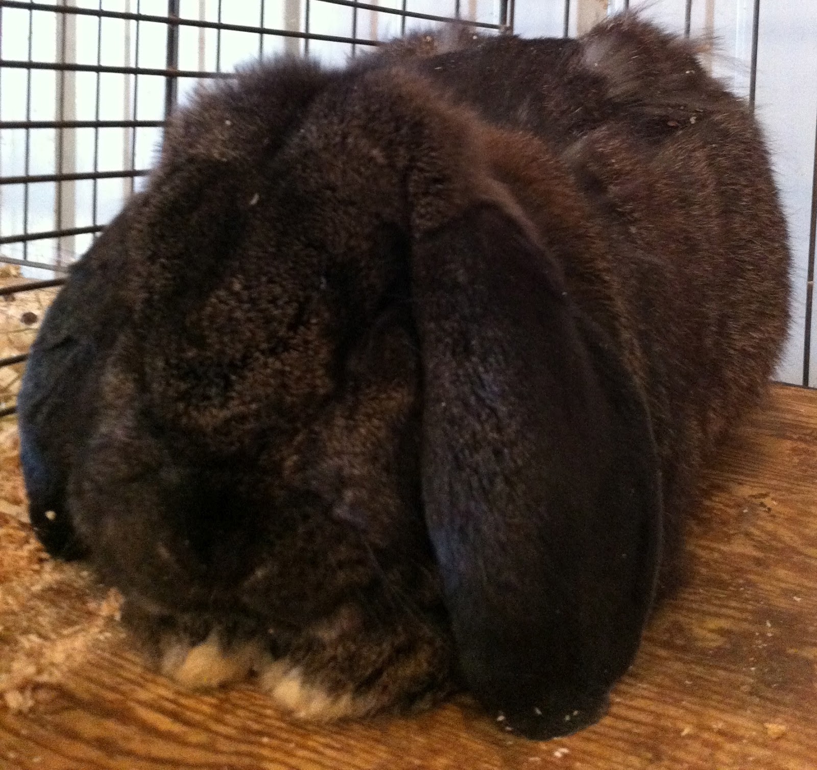
The rabbits! I had never seen such varied textures and ears on bunnies before. Several of them really did look like velveteen rabbits! Quite lovely! Their color was not black, not brown, and not grey, but a combination of all.
A Velveteen Rabbit, more like a silk velvet rabbit! So soft!


 Feathers and fur, beautiful textures and such personalities!


It was quite a fun thing to do for a couple of hours on a beautiful Sunday afternoon.


Saturday, August 4, 2012

The Language of Color

A spoonflower color map for selecting color


There hasn't really been an opportunity to share with anyone the experience in the color class, not to the depth that I would like to share. I realize, the experience hasn't become fully integrated. It is important for me to review what I have experienced and put into words what I was inspired by. What did I feel? What did I think of the information? Was it consistent with the color presentations that I currently have in place?  How do I see myself using the information? What do I already do that was confirmed? What is missing that can make a big difference in how I use and share the information and my passion for color and design?

I have added design for this reason. Color is a design element. It is the context of how it is used that determines it's success in an application.

For example, how color is used in a quilt varies from how it is used in an interior application or how a color is used in packaging, on a product or for a car.. the color communicates something to the viewer or the audience. It is the addition of the other elements and principles of design that can have the potential to diminish or exaggerate the color message. The line and the shape can have as much communication power as the color selection, yet, color is most likely the most communicative of any of the design elements- it elicits a quicker response than the written word. The mind often times acknowledges the visual cue (or in this case hue) before the written word itself.... This can be illustrated by the Stroop effect or sometimes called the Stroop test.  (the first link describes the theory, the second link takes you directly to the test/experiment)

This is my passion! I love experimenting with different applications and discovering how to convey the same message. Color is different in every space, every application. Every finish and substrate has its own influence on how the color is perceived. The reflective quality of the surface and the lighting, natural vs. artificial will impact how a color is perceived.

There are so many areas of color to explore and discover, I become overwhelmed with its magnitude. It is truly a language all to itself. Each hue has a meaning that is universally and collectively accepted*. In my experience and the experience of other professionals, I have found, is that if the individual connotation of the color is different than the collective, it is due to a traumatic or unpleasant memory, usually from childhood. The color is collapsed with the event and becomes a substitute of the memory. The color elicits the emotion that the incomplete event would evoke if it were recalled. It is essential for a color consultant to set aside his or her personal color connotations in any type of color recommendation. Wether it be for a product, logo development and brand recognition, the color of someone else's living room or the scarf color most appropriate for accessorizing their wardrobe, color objectivity is essential.

*There is a cultural aspect to color that is unique to traditions in specific parts of the world. The impact of these cultural connotations is becoming secondary to the more universal communication of the color message. Could the universal communication of color be due to the physiological responses to color? Nature is also a factor in how color is responded/reacted to in the different areas of the world.

White in Greece is different than White in Minnesota..
Santorini Church-Greece (the link to where I pulled the photo)

My previous neighborhood-bad winter that year! 


Wednesday, July 18, 2012

The Colors of Bainbridge and Seattle

I slept in this morning. Yesterday was a day of waiting. Waiting to check out, waiting for a cab, waiting for the ferry, waiting for the ticketing counter to open.. That was a long one! I wanted so desperately to check my luggage. I couldn't go through security without checking my bags, so I waited, 3 hours outside the gate, then another 3 hours inside the gate. But that was not the highlight of my trip.


The colors were fabulous! On the plane, was a magazine that featured the 2012 color of the Year! And I was on my way to learn about color from the woman who determined this! How exciting!

Using knowledge of trends, access to cutting edge design, psychology and lots of research, she does color forecasting and is involved in product development for many industries. Many of you who have had me specify color for your homes, businesses and personal projects, benefit from the same process.

I am inspired to take my skills and talent to a new and expanded level. I will be working on customizing presentations and tweaking the ones that are all in place for many industries, Quilting, Custom Picture Framing, Image Consulting, Interior Design and any other area that people apply color. That is my inspiration on the first day back. That is what is going to get me through the next few months of finding a place to live and unpacking. There is a great deal of stuff packed away and right now, this is the only thing I have access to. (the apron is still out and can be finished... maybe by next week. There are a few things I can keep busy and share.

We are definitely embarking on a new journey. Every day has a new experience just waiting to be discovered.

A "Few" of my favorite photos.... enjoy...
Some of the flowers on Bainbridge Island

Vibrant Periwinkles.... 

and pink Hollyhocks... mmmm....

Pike's Market in Seattle

The carpet sample rack of custom looped carpets. Yummy!

A bench with carpet upholstered over it in bright hues.

The sun setting behind us, in the airplane. Look at the beautiful band of bright yellow just above the clouds!